# The Photo-to-Editorial Sheet: turning an ordinary phone photo into an editorial page
This page hands you the Photo-to-Editorial Sheet: the direct link to the prompt behindphoto-abstract-editorial, the guide to which photos actually survive the process, and the
two settings worth changing. The tool itself is a free GitHub repository by ZzzLc0405 that
takes one photograph and returns an editorial composition: your photo kept faithfully on
top, an abstract panel beneath it rebuilt from that photograph's own spatial relationships,
and a two-to-five-word title it writes itself.
It picked up 3,716 stars in its first eleven days.
It is not a filter. It reads the picture first.
A filter lays something over your picture. This reads the picture first.
The published prompt is explicit about the sequence: deconstruct, selectively preserve,
abstract, reconstruct. Before it draws anything it identifies the three to six most
important spatial facts in the photograph. Subject relationships, relative scale,
left/right and upper/lower position, direction, intervals, occlusion, foreground and
background hierarchy, colour roles, negative space. Then it removes surface texture,
perspective detail and background noise, and reorganises what is left with the fewest
possible marks.
The instruction that governs everything downstream is one sentence: **every mark must
correspond to a fact in the source photo.** No decoration to make the composition
attractive, no symmetry it did not find, no accent colour that was not already there.
Two supporting rules do most of the visible work. It uses one primary mark family and at
most two supporting families, so the whole vocabulary of a panel is three things. And it
keeps 65 to 80 per cent of the panel as clean whitespace, on a flat ivory field with no
gradient, grain, vignette or paper texture of any kind.
We ran it on two of our own photos
Not on a curated test set. Two ordinary phone photographs, the prompt copied verbatim from
the repository, one pass each, first return kept.
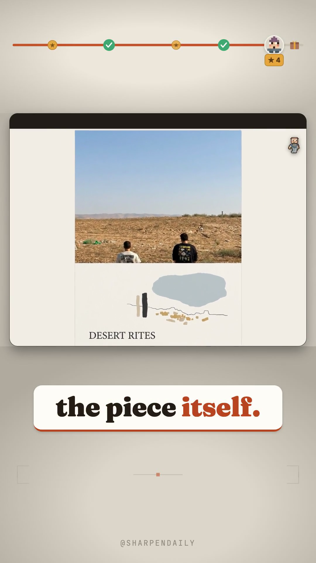
The desert one is deliberately the plainest image we had: two people standing on a flat
piece of ground, mid-afternoon, nothing composed about it. The panel came back with two
upright marks (one pale, one dark, which is what the two of them were wearing), a single
thin horizon line with a few irregular breaks in it, a handful of small ochre marks where
the stones were scattered, and one soft mass for the sky. Every element traces to
something. It titled the piece *Desert Rites*.
The monastery one has a figure looking across a valley at a cliff-side building under a
low sun. Here it did the opposite thing and did it correctly: it kept the figure small,
reduced the architecture to a few stacked masses, and let the sun carry the composition. It
called that one *Monastic Silence, Unbroken Light*.
The second is prettier. The first is the better demonstration, because you can point at each
mark and name the thing in the photograph it came from. That is the test for whether the
process read your picture or only decorated it.
The honest limits
The licence is not unrestricted. It is free for personal, educational and non-commercial
use; commercial use requires the author's prior authorisation. Read it before you sell a
print. This is also why the sheet links you to the prompt in his repository rather than
pasting a copy into a zip.
The repository is a prompt, not a stack. It names no model. We ran its published English
prompt through an image model of our own choosing, so what we are showing is a faithful run
of the *process*, not of the author's exact setup. Anything that takes an image in and gives
an image out will do; the test is whether it can hand your photograph back unchanged at the
top of a new composition.
Output quality depends on the model you bring. A weaker one drifts toward tracing your
photo or toward generic shapes that correspond to nothing in it. If the panel looks like
clip art, that is the model, not the prompt.
Do not shorten the prompt. Most of its length is load-bearing: the mark budget, the
whitespace floor, the ban on texture, and the rule that stops it drawing separate heads and
limbs for people. Trim those and you get a filter, which is the one thing it is designed not
to be.
What is in the sheet
- Get the prompt. Direct and raw links, the licence, and how to run it on any
image-capable model.
- Which photos survive the process. What works (a clear horizon, two or three figures
with space between them, a distinctive silhouette, one strong light source), what fights
back (busy scenes, tight portraits, flat grey light, anything with text in it), and the
one-line test for whether it worked.
- What to change. The photo-to-panel ratio and the accent saturation are worth a second
pass; the whitespace floor, CLEAN mode and the title rules are worth leaving exactly alone.
Plus one trick that is not in the prompt: run the same photo twice, because the abstraction
step makes real choices and the second read is often the better one.
Comment PHOTO and it is yours.